CSS has a lot of different units that you can choose from. In many cases, there is one unit that’s clearly better than any others.
However, one question that seems to come up throughout my career is whether you should use pixels or rems on certain properties where it doesn’t seem to make a clear difference.
Today I’m going to answer that question.
The Setup
Let’s say we have a very basic HTML page with two paragraphs: one sized with pixels and the other with rems:
<!DOCTYPE html>
<html>
<body>
  <h1>PX vs. Rem</h1>
  <p style="font-size: 24px;">My font size is 24px</p>
  <p style="font-size: 1.5rem;">My font-size is 1.5rem</p>
</body>
</html>

Pixels are an absolute unit, so when you set the font size to 24 pixels, it’s going to be 24 pixels. Rems, on the other hand, are relative units that are based on the document’s font-size. The document’s default font size is 16 pixels, so 1.5rems x 16px is the equivalent of 24 pixels.
The fact that rems are relative and they’re based on a default of 16 pixels makes them harder to work with than pixels. Which is why, more often than not, I see folks using pixels. But I think it’s a mistake.
The Not-so-real Problem
In the past, there was some confusion around how retina or high-density displays affected pixels and pixel density. Without getting too far into it, there was a moment when pixels scaled weirdly, but that issue has since been fixed.
And since that has been fixed, an argument I keep seeing is that is that users can scale the font size up and down by zooming the browser in or out, and both the pixel and rem sizes grow at the same rate.
As a result, some folks say that it no longer matters whether you use pixels or rems.
But it does!
The Real-real Problem
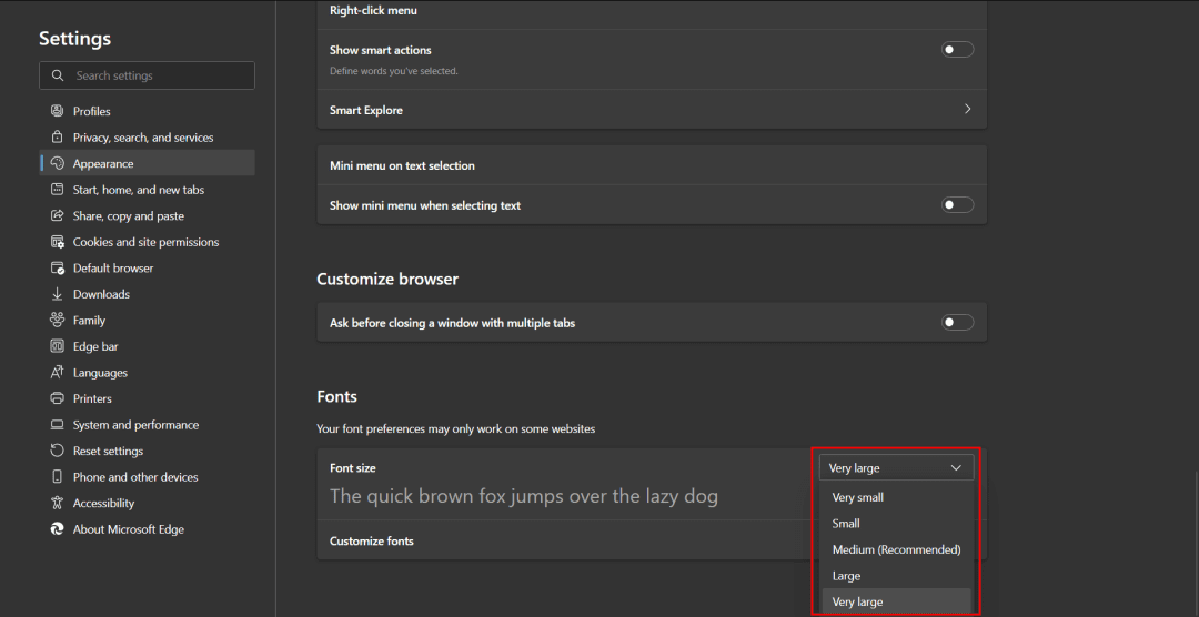
This issue actually relates to how CSS units respond to browser settings. Users can go to their browser settings and modify the browser’s default font size.

This is great for users that have visual impairment.
However, if you check the browser, the paragraph with the absolute unit of 24 pixels will remain at 24 pixels the same regardless what the user’s preference is. The relative unit, on the other hand, grows with the default settings of the browser.

So this is really an accessibility concern.
Therefore, any time you’re defining font-sizes, you should absolutely (or relatively?) use rems.
The Nuance
Of course, because we’re talking web development, the discussion is nuanced. For example, what about other properties like padding and border?
<!DOCTYPE html>
<html>
<body>
  <h1>PX vs. Rem</h1>
  <p style="
    font-size: 24px;
    padding: 16px;
    border: 2px solid;
    background: tomato;
  ">
    My font size is 24px
  </p>
  <p style="
    font-size: 1.5rem;
    padding: 1rem;
    border: .125rem solid;
    background: powderblue;
  ">
    My font-size is 1.5rem
  </p>
</body>
</html>
In this example, we’ll compare pixels vs. rems for padding and border-width in addition to font-size.

As you might expect, the second paragraph has larger padding and border-width in addition to the larger font-size because rem units scale up with the browser settings.
And this brings us to the “it depends” of the conversation. Padding and border-width are not really strictly related to accessibility. So do you want your padding or border-width or any other property that could otherwise be pixels to be set with rems and scale up if the user changes their settings?
That’s up to you ¯\_(ツ)_/¯
It gets even more confusing when you introduce media queries or container queries. It’s very complicated to explain, but basically, if your fonts scale up with the browser settings, you probably also want your media queries to respond in kind. This means you should define them with REM (or EM) units.
Of course, there are a lot of factors that play in there and I don’t want to get too lost in the weeds. Fortunately, there was an article in 2016 that basically tackled that question called “PX, EM or REM media queries” by Zell Liew.
It basically concluded by saying that EM units and REM units are going to be better for media queries than pixel units and because EM units are based on their parent element, but media queries affect the root styles, both EM and REM are pretty much the same.
The only difference was due to a bug in Safari with REM units, therefore EM was a little bit more consistent than, but I think that bug has been fixed. So I would just stick to using REM.
The Short(ish) Answer
So to answer the question, once and for all, whether you should use pixels or rems, the short answer is…
Just use rems!
Of course, there’s nuance. Of course, there are exceptions. Of course, there will be cases in which pixels actually are better.
(You really should test your application with various browser settings to make those calls).
BUT
Rems are more accessible for font-size.
Rems are (probably) better for media queries.
And I think it’s easier to just stick to one simple rule (with occasional exceptions) than it is to mix things.
At the end of the day, it all depends on how things should scale based on the user’s browser settings, so it may not matter all that much to you. But it makes sense to me that everything scales up or down at the same rate.
If you feel different or you would like to contribute to the conversation, I would love to hear your thoughts.
Thank you so much for reading. If you liked this article, please share it. It's one of the best ways to support me. You can also sign up for my newsletter or follow me on Twitter if you want to know when new articles are published.
Originally published on austingil.com.

