TLDR:
<img>with justsrc: Easy to implement. Good developer experience. No responsive images. No modern formats with fallbacks. Likely uses more bandwidth. Worst user experience.<img>withsrcsetattribute : Moderate work. Ok developer experience. Supports responsive images for less bandwidth. No modern formats with fallbacks. Leaves potential savings on the table. Ok user experience.<picture>with multiple<source>andsrcset: Supports responsive images and modern formats with fallbacks. Would rather squirt jalapeno juice in my eyes.<img>with justsrcwith Image Manager : Easy to implement and automatically sends images in the best size and format. Win-win for developers and users!!!
Let’s say we have just a basic website that is loading an image from my domain. The code our might look like this:
<!DOCTYPE html>
<html>
<body>
  <img
    src="https://images.austingil.com/wp-content/uploads/Command-Line-Blog-Cover.png"
    alt="Command line terminal and old PC with an indigo brush stroke in the background."
  >
</body>
</html>
An HTML document with a single image tag that has a src and an alt attribute. This technically works fine. It serves the image as expected, but there’s a couple of problems with this image.

On a large screen, this image would be just fine, but for users with small screen devices, a 1200px wide image means they’ll have to to download a larger image than they need. That could take longer to download and it could cost them money on their data plan.
Step 1: Optimize & Resize Images
This first step is a critical one, but also one that I think most folks are familiar with so I won’t go too deep.
- Images on your website should only be as large as they need to be. If your image will only be 600px wide by 400px tall, you shouldn’t make people download a 1200x800px image.
- Most websites don’t need images to be the highest quality possible. You can remove a lot of unnecessary data without losing quality by compressing the image.
Squoosh is a really awesome app to do this manually.
You can also have it done automatically if the images are in your GitHub repo with imgbot.
Step 2: Create Responsive Images
Images can have a srcset attribute allowing us to define multiple sources for the image based on certain device characteristics such as the device width.
We can add a srcset attribute to our image tag like this:
<!DOCTYPE html>
<html>
<body>
  <img
    srcset="
      https://austingil.com/wp-content/uploads/Command-Line-Blog-Cover-1080x540.png 1080w,
      https://austingil.com/wp-content/uploads/Command-Line-Blog-Cover-480x240.png 480w,
      https://austingil.com/wp-content/uploads/Command-Line-Blog-Cover-200x100.png 200w,
      https://austingil.com/wp-content/uploads/Command-Line-Blog-Cover-768x384.png 768w,
      https://austingil.com/wp-content/uploads/Command-Line-Blog-Cover.png 1200w"
    src="https://cdn.statically.io/img/austingil.com/f=auto%2Cq=70/wp-content/uploads/Command-Line-Blog-Cover.png"
    alt="Command line terminal and old PC with an indigo brush stroke in the background."
  >
</body>
</html>
I link to five different images of five different sizes and define their corresponding viewport widths. If we open our image in the browser nothing visually has really changed. But under the hood there are some improvements.
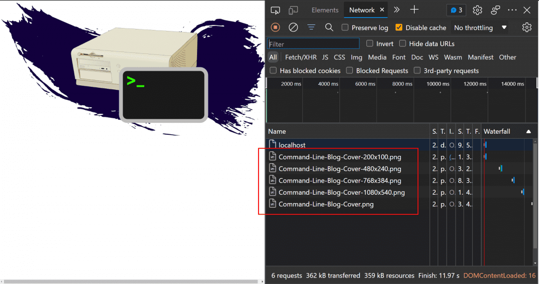
Open the devtools network tab as we reload on different screens.
On a large screen, we’ll see the full sized image is downloaded (Command-Line-Blog-Cover.png) as we did before. Nothing special.

But if we start on a screen that is 200px or narrower, we load the 200x100px image (Command-Line-Blog-Cover-200x100.png).

That size is going to be a lot smaller and faster for the user to download.
One problem with just sending a smaller image is what happens if the user originally loads the page on a small screen, then resizes their browser to something larger? Stretching a small image on a larger screen would pixelate it.
That doesn’t happen with the srcset attributes (assuming we provide the right images) because as resized from the smallest screen to the largest screen, new images get downloaded corresponding with their break points.


Conveniently, that same behavior doesn’t happen the other direction, large screen to small screen, because after all, you can serve a large image on a smaller screen and it can shrink without losing quality. You don’t want to download extra images as the screen gets smaller, because that would use more data without any added benefits.
That’s a really handy way to improve user experience by saving on bandwidth and improving performance by serving the right image at the right size, but there’s still room for improvement.
Step 3: Use Modern Image Formats
The image we’re loading is a PNG, but modern browsers support new image formats such as WebP or AVIF. These formats provide much higher compression rates without noticeable data loss which means we can effectively serve the same image in a much smaller file size.
Once again, the browser has us covered with the HTML <picture> element.
Sort of similar to the srcset attribute, the picture element allows us to define different image sources to serve based on the device characteristics.
So we can do things like provide different images based on the device width, or different pixel densities. But one thing that sets the picture element apart from the srcset attribute is we can target different mime types.
Let’s add a picture element to our example that includes AVIF and WebP formats if the browser supports them. And of course, we’ll also want to continue serving responsive versions.
<!DOCTYPE html>
<html>
<body>
  <picture>
    <source
      type="image/avif"
      srcset="
      https://austingil.com/wp-content/uploads/Command-Line-Blog-Cover.avif 1200w,
      https://austingil.com/wp-content/uploads/Command-Line-Blog-Cover-1080x540.avif 1080w,
      https://austingil.com/wp-content/uploads/Command-Line-Blog-Cover-768x384.avif 768w,
      https://austingil.com/wp-content/uploads/Command-Line-Blog-Cover-480x240.avif 480w,
      https://austingil.com/wp-content/uploads/Command-Line-Blog-Cover-200x100.avif 200w"
    >
    <source
      type="image/webp"
      srcset="
      https://austingil.com/wp-content/uploads/Command-Line-Blog-Cover.webp 1200w,
      https://austingil.com/wp-content/uploads/Command-Line-Blog-Cover-1080x540.webp 1080w,
      https://austingil.com/wp-content/uploads/Command-Line-Blog-Cover-768x384.webp 768w,
      https://austingil.com/wp-content/uploads/Command-Line-Blog-Cover-480x240.webp 480w,
      https://austingil.com/wp-content/uploads/Command-Line-Blog-Cover-200x100.webp 200w"
    >
    <img
      src="https://cdn.statically.io/img/austingil.com/f=auto%2Cq=70/wp-content/uploads/Command-Line-Blog-Cover.png"
      alt="Command line terminal and old PC with an indigo brush stroke in the background."
    >
  </picture>
</body>
</html>
(We don’t need srcset on the <img> tag because that serves as a fallback for older browsers which don’t support srcset anyway.)
Alright, we’ve got an image that will only give the user the most modern image format at the smallest size necessary.
Isn’t the code above just…beautiful…?
Really makes you want to add new images to your site, right?
RIGHT!?!?
(ಥ◡ಥ)
Holy crap! No! What have we done!?!?
Step 4: Start Questioning Life Choices
…
(🎶 Hello darkness, my old friend… 🎶)
…
Step 5: Simplify Modern Image Formats
OK, now that we’ve taken care of that, clearly, the solution above isn’t great.
We need a different version of our image for every format and device width that we want to target. From the example above, that’s eleven versions of the same image (5 AVIF, 5 WebP, 1 PNG).
Although browsers provide us with features to serve better images and provide a better user experience, it comes at a cost to developer experience.
(And who wants to pay that? Not me!)
We could automate the process when images are uploaded to generate the different formats and sizes then store those details in a database. There are tools that can help, like sharp, but that’s still a lot of work. I rarely see folks doing this because it’s either too much work, or they just don’t consider it.
My advice is to outsource.
Today I’ll be using Akamai Image and Video Manager because it’s the service I’m most familiar with, although there are others that do the same sort of work. The main goal is to serve the best image for the user without making developers go crazy.
I’ve set up an instance of Image Manager at images.austingil.com.
To add an image from my domain, I can imply add the “images” prefix to the regular image URL. So “austingil.com/wp-content/uploads/Command-Li..” becomes “images.austingil.com/wp-content/uploads/Com..”.
Nothing too interesting.
But let’s go back to our code, get rid of the <picture> element, and replace the old URLs and see what we can do:
<!DOCTYPE html>
<html>
<body>
  <img
    srcset="
      https://images.austingil.com/wp-content/uploads/Command-Line-Blog-Cover-1080x540.png 1080w,
      https://images.austingil.com/wp-content/uploads/Command-Line-Blog-Cover-480x240.png 480w,
      https://images.austingil.com/wp-content/uploads/Command-Line-Blog-Cover-200x100.png 200w,
      https://images.austingil.com/wp-content/uploads/Command-Line-Blog-Cover-768x384.png 768w,
      https://images.austingil.com/wp-content/uploads/Command-Line-Blog-Cover.png 1200w"
    src="https://cdn.statically.io/img/austingil.com/f=auto%2Cq=70/wp-content/uploads/Command-Line-Blog-Cover.png"
    alt="Command line terminal and old PC with an indigo brush stroke in the background."
  >
</body>
</html>
I don’t think anyone will complain about this compared to using the <picture> element with AVIF and WebP. This is definitely less work, but what about the results?
If I reload the page, we can see that the same image is coming across (“Command-Line-Blog-Cover.png”), but if we look at the response headers, things get a little bit interesting.

Although the request is for a PNG image, the response is actually sending a WebP data. This results in a smaller image size, which means just by turning on the image manager, I’m already saving bandwidth for my users without having to do anything.
Step 6: Simplify Responsive Images
We’ve improved the formats, but what about that responsive image size?
I still have the srcset attribute set up to serve small images on small screens, and large images on large screens. But this system still relies on providing five different images with five different resolutions.
Still a pain.
Just offering uploads can be a big feature to add, let alone resizing and storing different images. Fortunately for us, because we’re using the image manager, we can actually make this process a lot simpler.
Instead of using five different images of different sizes, I’m actually going to reference the same image multiple times. But I’m going to append a query string parameter that explicitly defines what size I want to target.
<!DOCTYPE html>
<html>
<body>
  <img
    srcset="
      https://images.austingil.com/wp-content/uploads/Command-Line-Blog-Cover.png?imwidth=1080 1080w,
      https://images.austingil.com/wp-content/uploads/Command-Line-Blog-Cover.png?imwidth=480 480w,
      https://images.austingil.com/wp-content/uploads/Command-Line-Blog-Cover.png?imwidth=200 200w,
      https://images.austingil.com/wp-content/uploads/Command-Line-Blog-Cover.png?imwidth=768 768w,
      https://images.austingil.com/wp-content/uploads/Command-Line-Blog-Cover.png 1200w"
    src="https://cdn.statically.io/img/austingil.com/f=auto%2Cq=70/wp-content/uploads/Command-Line-Blog-Cover.png"
    alt="Command line terminal and old PC with an indigo brush stroke in the background."
  >
</body>
</html>
Note that now every image URL goes to the same “Command-Line-Blog-Cover.png” file, but some of them have an additional imwidth query string appended.
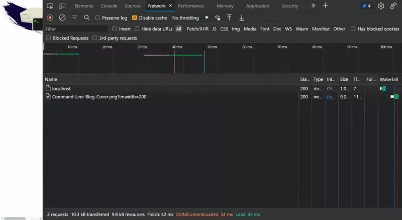
If I reload on this small screen and resize to a larger screen as we did before, we see a similar behavior. Different images with different sizes are loaded in for their respective screen sizes.

But there’s one big difference here. Instead of having to create, upload, and manage five different images of different sizes, we only have to worry about one image.Different sizes are generated via queer string parameter.
It’s a lot less work than it could have been otherwise, especially if you are using a component based framework.
But we can do even less work!
We can go back to using just the image URL, and let Image Manager choose the right size for us.
To showcase it, I like to open the image in a new tab, instead of the website. Hovering over the browser tab shows me the dimensions of the image, 1200x600px.

If I open up my devtools, I can go to the Elements tab and simulate a different device such as an iPhone SE

Now something interesting happens when I reload.

Despite the fact that the URL is exactly the same, I can see that the image is about half the size. And hovering over the tab confirms that the dimensions are 640x320px.
And the best part? All of the work to determine which image to serve happens without me, the developer, having to do anything. The device characteristics are sent with every request automatically, and Image Manager is responding with a much smaller image.
To be honest, I can’t actually explain how it works. It’s just magic and it’s super cool and makes my life easier and my users lives better.
(If you’re actually curious how it works, hit me up on Twitter and I’ll find out for you.)
If you’re an Akamai customer and you’re not using this feature, you should get on it right away!
Optional “I’m a badass” Step: Roll Your Own!
I also want to share a couple of alternatives for folks that are not Akamai customers. There’s two open source projects that look like they offer similar features, although I have not personally used them.
One of them is called imgproxy. The other one is called Thumbor. They both look pretty easy to install as long as you’re comfortable using Docker.
I really like Linode for cheap, powerful VPS, and if you want to try launching an instance of either of these, you can use this link to get $100 credit.
I’m a big fan of the DIY approach, but I don’t think it’s without downsides (I mean, besides set up and maintenance). I’m not sure where the images are hosted with these services. If they are hosted on the same server as the install, then there’s two possible issues.
- If you’re generating a bunch of versions of the same image, those have to live somewhere. If they live on the same VPS, that can get more expensive. Try to use something like Object Storage for the images as that has cheaper storage fees.
- Loading images from the same location might cause latency issues. Image Manager has the Akamai CDN network available, so images will always come from the nearest location to the user. This can greatly speed up download times.
That said, I think it’s still worth checking out.
If you do get it working and you like it, please come back and let me know how it went. What went well, what didn’t work, what’s awesome, what’s missing?
Closing Thoughts
Well, that’s all I got for you today. We walked through distinct options for handling images and their pros & cons. Started with just <img> with a src attribute, added a srcset attribute, moved on to <picture> with different <source> tags, and ultimately burned it all down to come back to just <img> with src attribute, but incorporated Image Manager.
In other words, it was a very roundabout journey to go from this:
<! – BAD – >
<img
  src="https://austingil.com/wp-content/uploads/Command-Line-Blog-Cover.png"
  alt="Command line terminal and old PC with an indigo brush stroke in the background."
>
To this:
<! – GOOD – >
<img
  src="https://images.austingil.com/wp-content/uploads/Command-Line-Blog-Cover.png"
  alt="Command line terminal and old PC with an indigo brush stroke in the background."
>
How anticlimactic.
Anyway, I hope you enjoyed it and I hope you implement some of these solutions because sending smaller images with modern formats is a great way to make the internet a faster and greener place.
Thank you so much for reading. If you liked this article, please share it. It's one of the best ways to support me. You can also sign up for my newsletter or follow me on Twitter if you want to know when new articles are published.
Originally published on austingil.com.

